case study
Kingston WritersFest 2023 Campaign Designs
Challenge
Every year, Kingston WritersFest selects a new theme to shape the festival around. This theme is not just an abstract concept but serves as a guiding framework, influencing a wide range of decisions. From the general ideas and values the festival aims to promote, to the types of authors and stories that are highlighted, to the diverse topics and discussions that are featured, everything is carefully curated with the theme in mind. The theme becomes a cornerstone of the festival’s identity for that particular year, creating a cohesive experience for attendees. It also needs to be represented visually through the artwork, which plays a crucial role in conveying the essence of the theme. For 2023, the theme was one of breaking limits, crossing barriers, and pushing the envelope. In a word, the theme was unbound, encapsulating the spirit of challenging boundaries and exploring new horizons. This concept needed to be translated into a visual design that was both simple and direct, ensuring that it could be easily understood at a glance while still leaving room for personal interpretation from each viewer. The goal was to create an image that resonated universally, capturing the dynamic energy of the theme without overwhelming the viewer, allowing them to connect with the concept in their own way.
Approach
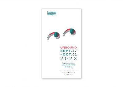
To emphasize the theme, a minimalist design approach was chosen to create a pair of ‘eyes’ formed from quotation marks. This clever visual symbolizes the viewer, capturing the idea of being invited to peer into the diverse array of ideas, stories, and topics that the festival brings together. The use of quotation marks not only alludes to the act of reading and storytelling but also infers a sense of emotion—one of curiosity, thoughtfulness, or even whimsy, as the eyes appear to be looking off to the side, suggesting openness to new perspectives and endless possibilities.
Staying true to the simple, clean aesthetic, the design incorporates color bars from the newly established palette, arranged in a repeating pattern around the eyes. These color bars represent the variety of events and topics featured throughout the festival. Their rhythmic repetition creates a sense of structure and continuity, reinforcing the idea that the festival is an ongoing journey of discovery. By keeping the surrounding space stark white, the focus remains on the central design, highlighting the festival’s role in broadening people’s horizons and offering experiences that are truly unique and unlike anything else. The white space evokes a sense of clarity and openness, symbolizing the blank slate of possibilities that the festival presents to its attendees, inviting them to step into a world of creativity, exploration, and new knowledge.
Thoughts
Kingston WritersFest was a longtime client, and I’ve been working with the team since 2015. This was a unique year given how far the team wanted to work outside the box, and thus wanted to find a graphical solution that went beyond the usual concepts chosen in prior years. This concept won out and I developed everything from the theme, graphics, typography, to all collateral and print/digital pieces. This artwork was well received, and the accompanying microsite that went with it was successful enough with visitors and team members alike that it formed the base for a full overhaul of the full KWF site for 2024. All in all, 2023 was a brilliant year for this project.


