case study
Amplify Marketing & Communications Branding and Website
Challenge
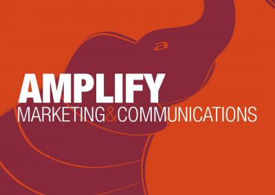
Amplify has continually evolved its brand since its inception, adapting to shifts and expansions in its client base and areas of focus. To better communicate its services and values, a comprehensive redesign was needed—one that included well-developed copy to effectively engage potential clients. This overhaul required a revamped website, creative direct mail pieces, and updated collateral that made better use of the logo and maintained a cohesive, unified appearance.
Approach
Paired with a striking two-color palette and a clean sans-serif typeface, the Amplify brand took shape, serving as a cohesive visual identity across both print and digital assets. Alongside a range of print materials and collateral, the website was developed to give potential clients a clear understanding of the company’s services and expertise. It needed to be functional, responsive, and visually compelling—a seamless extension of the brand’s identity and purpose.
Thoughts
I have worked with Amplify for a long time and have witnessed its brand evolve alongside the business. The website played a crucial role in attracting potential clients and showcasing its work, requiring continuous refinement to balance aesthetics with an optimal user experience. Of all the websites I’ve worked on, this is one I’ve dedicated the most time to, consistently improving and enhancing it over the years. The hardest part was designing for oneself — creatives are often their own toughest critics, caught in a cycle of constant iteration, second-guessing, and overanalyzing. Breaking out of that loop was just as important as the design itself.

Branded Collateral

Sample Presentation Template

Sample Case Study

Direct Mail Samples